B2B software companies lose buyers when their website talks about technology. Nakamir's redesign put real workers front and centre — and built a conversion-first story around them.
Nakamir builds AI tools that make industrial workers faster and safer. Their website was explaining the AI. It wasn't explaining the worker. Enterprise buyers in manufacturing and aerospace weren't seeing themselves in the product — they were seeing dashboards and feature lists. The redesign fixed that.
Nakamir is an AI workforce training platform. Their two products address a real gap in industrial operations: training is expensive, slow, and inconsistent across sites. PRISM converts screen recordings into structured, step-by-step training documents automatically. NARA is an augmented reality assistant that guides workers through real procedures in real time — on the factory floor, not in a classroom.
Their buyers are operations directors, HSE managers, and L&D leads at companies in Manufacturing, Aerospace & Defence, Automotive, and Energy. These are people who measure success in error rates, onboarding time, and compliance pass rates — not in AI capability benchmarks.
The previous site spoke to engineers who understood the technology. The redesign had to speak to buyers who care about one thing: what changes for my workforce when we use this?
The strategic shift the client approved: move from system-focused narrative to human worker-focused narrative. Every section had to answer the question a buyer actually asks — "Will this make my team better?"
Three limits shaped every design decision in this project:
No new photography budget. All imagery had to come from stock libraries and existing Nakamir brand assets. Building a worker-focused narrative meant finding stock imagery that felt real and specific — not generic "person at a computer" enterprise photography.
Six pages maximum in v1 scope. Home, NARA, PRISM, About, Contact, and Legal. Mobile design was explicitly deferred to Phase 2. Every design decision was made with the desktop buyer journey as the primary surface.
Existing brand identity was locked. Logo, colour palette, and brand mark were non-negotiable. The visual refresh had to work within those constraints — not replace them. The upgrade was in hierarchy, copy, and narrative structure, not in the visual system itself.
The issue wasn't design quality — it was narrative architecture. The site was structured around what Nakamir built, not around what their buyer needs to believe before they book a demo.
"AI-powered training platform" describes a category, not a problem being solved. Enterprise buyers skim heroes. If the first line doesn't resonate with a pain they feel today, they leave. The redesign opens with the outcome: workers complete procedures correctly, 10x faster than manual training.
An operations manager evaluating a workforce training tool wants to see their people using it — on a production line, in a maintenance bay, on a factory floor. The old site showed product dashboards. The redesign introduces process images: workers interacting with NARA overlays and reviewing PRISM documents in the field.
Every enterprise software buyer has the same question: what does my team's day look like after we buy this? The old product pages answered "what does PRISM do?" — not "what does PRISM change for my training team?" The redesign structures each product page around measurable outcomes: error reduction, onboarding time, compliance rates.
Buyers need to justify the purchase internally. They need to show a number. The redesign adds a before/after comparison module — Traditional Manual Training vs. AI-Powered Guidance — with specific metrics: 87% error reduction, 3 days vs. 3 weeks for onboarding, 95% procedure accuracy. These become the ammunition for internal buy-in.
A manufacturing safety manager has very different compliance concerns from an aerospace MRO team. Generic copy about "any industry" is a conversion killer — it signals the product isn't deeply built for your context. The redesign adds industry tabs with specific use cases, regulations, and outcomes for each vertical.
I approached this as a conversion architecture problem before a design problem. CRO for B2B enterprise works differently from consumer products — visitors don't convert on the first visit, there are multiple stakeholders involved in the purchase decision, and the "conversion" is a demo booking, not a transaction.
That shaped the structure: every page section had to serve a specific buying-stage purpose. Build credibility → show the problem → prove the solution → remove objections → make the next step obvious. Not every section is for every visitor, but the sequence builds toward the conversion action.
"The AI helps workers — it doesn't replace them." This became the positioning anchor that every headline, section, and CTA had to reinforce.
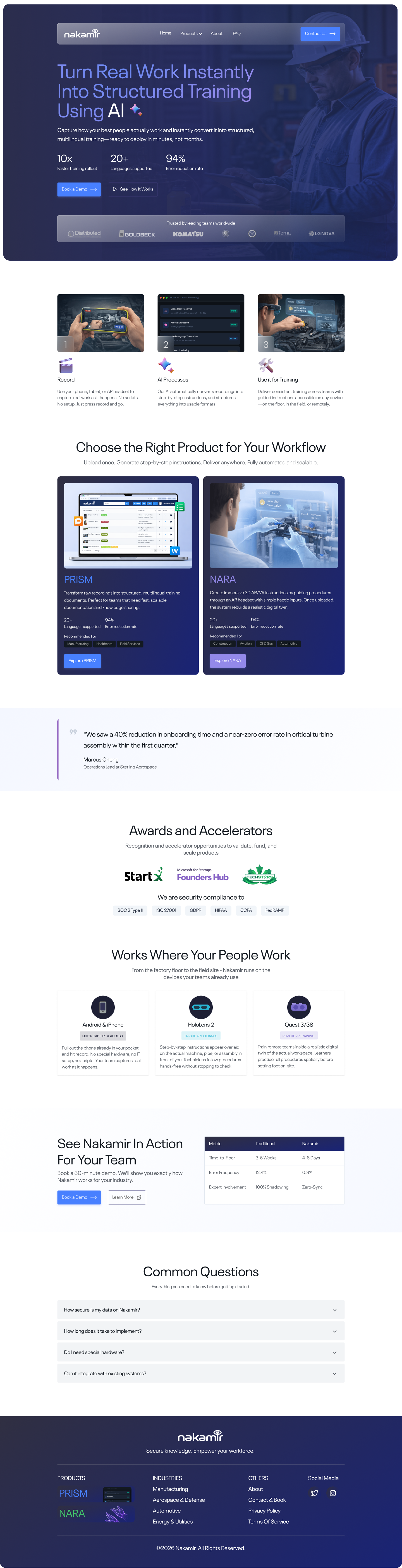
What changed: The hero now opens with industrial process photography — workers on a factory floor interacting with the product during their actual job. The headline shifts from "AI-powered platform" to "Turn Real Work Instantly Into Structured Training Using AI."
Why: In enterprise B2B, the first-second impression either builds identification or creates distance. An operations manager landing on a product dashboard feels nothing. Seeing a worker who looks like their team using the tool on a real production line creates immediate recognition — "this is for us."
Problem solved: Hero bounce. Buyers who don't immediately see themselves in the product leave within 8 seconds. Human-context photography extends engagement long enough to reach the proof sections.
Hero: "Turn Real Work Instantly Into Structured Training Using AI +" — workers shown in context, not product interfaces
What changed: A comparison slider on the homepage shows the key capacity difference: "Without Nakamir" vs "With Nakamir" — side by side with specific metrics attached. This sits directly below the product overview, before the buyer reaches the product detail pages.
Why: Enterprise buyers need to build an internal business case before they can book a demo. They need a number. The slider gives them the before/after narrative and the metrics in one moment — 10x faster training creation, 94% procedural accuracy — ready to paste into a slide deck.
Problem solved: The "so what" gap — buyers who understand the product but can't articulate why it's worth switching from their current manual process. The slider makes the ROI argument for them.
Product section with PRISM and NARA cards — key capacity metrics visible before the buyer clicks into a product page
What changed: Both product pages follow the exact same structure: clear headline → primary CTA → what it does in plain terms → industry use cases with outcome tabs → traditional vs. AI-powered comparison → supported devices. No structure-switching as buyers explore both products.
Why: Buyers often evaluate both products before deciding which to adopt first. If the pages have different layouts, they spend cognitive effort re-orienting instead of comparing. A consistent structure means the buyer can evaluate both products in parallel and reach the demo CTA faster.
Problem solved: Cognitive friction during product evaluation. When everything is where you expect it, the page disappears — the product story takes over.
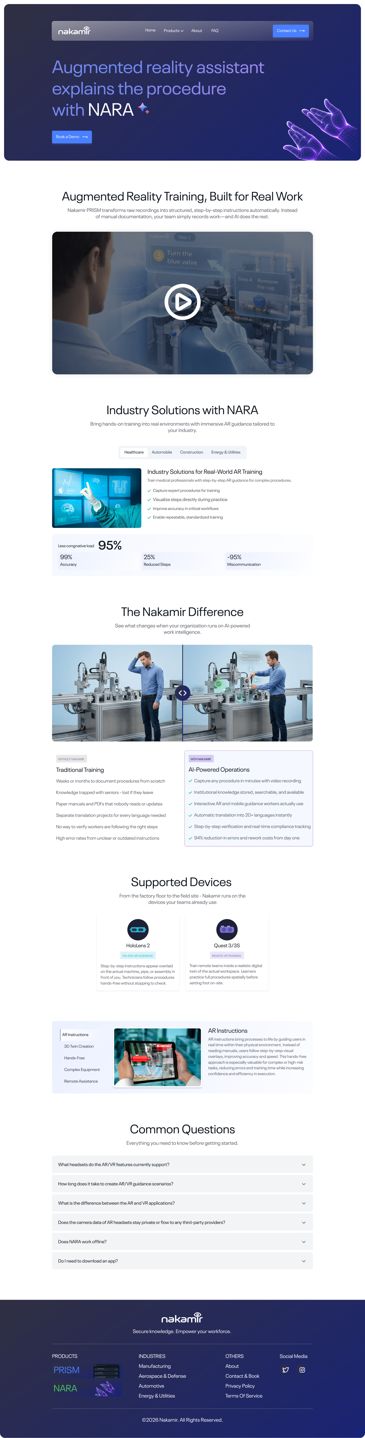
"Augmented reality assistant explains the procedure with NARA" — industry tabs, 95% accuracy stat, traditional vs. AI-Powered comparison, Oculus device support.
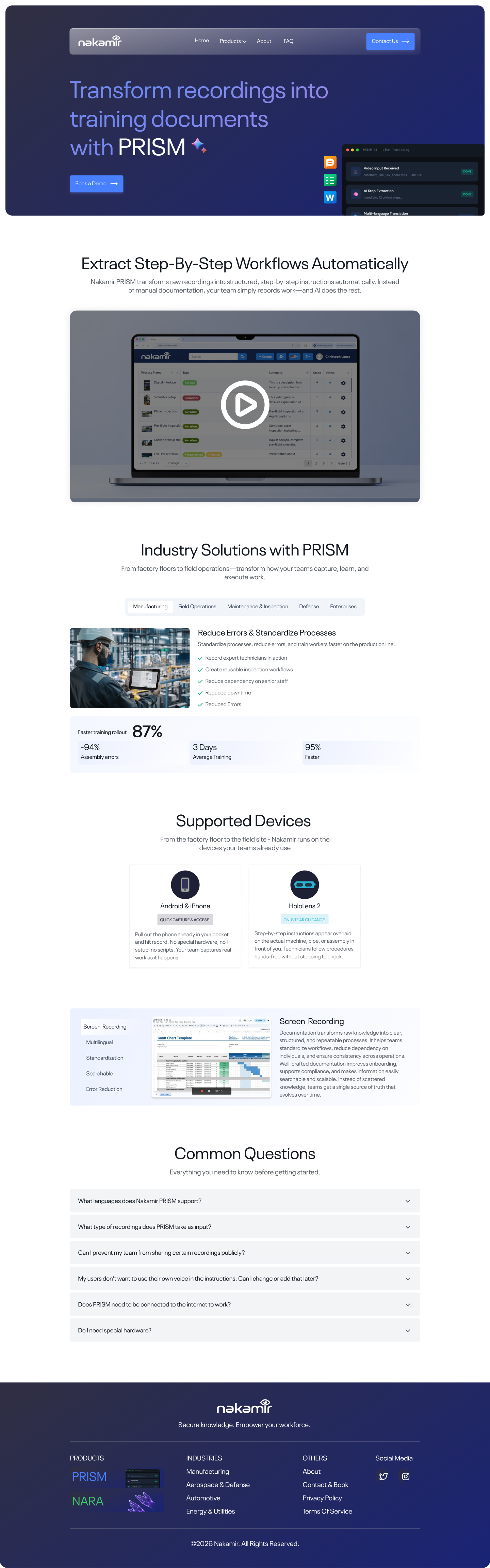
"Transform recordings into training documents with PRISM" — same structure: industry tabs, 87% error reduction, traditional vs. automated comparison, Android + Desktop support.
What changed: The About page leads with "Human Intelligence, Digitally Mastered" — the mission, not the founding story. Origins & Evolution shows the company's trajectory (Stanford roots, D.H. Media, Nakamir PRISM launch) as a proof-of-momentum timeline. The team section closes with human credibility — real names, real faces.
Why: Enterprise buyers check the About page to answer one question: can I trust these people with a long-term implementation? A company history doesn't answer that. A mission statement, a growth trajectory, and a real team does. Stanford accelerator roots and a named founding team signal credibility to procurement committees.
Problem solved: The "who are these people?" objection that kills enterprise deals before they reach legal. A credible About page removes that blocker early.
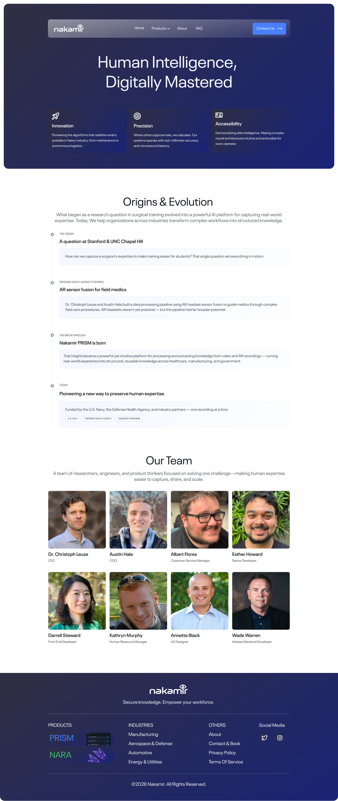
"Human Intelligence, Digitally Mastered" — mission lead, Origins & Evolution timeline, named team with photos
What changed: The Contact page has two explicit paths — "Book a Demo" (digital, instant, top of page) and an Office Location with a map (physical, relationship-first, for enterprise buyers who want to visit before committing). Common questions sit below both, handling last-mile objections.
Why: Large enterprise purchases — especially for manufacturing and aerospace where safety is on the line — often require a site visit or relationship meeting before sign-off. Hiding the office address signals a software-only company. Showing it builds the kind of trust that gets procurement approval.
Problem solved: The contact page was previously just a form. That works for SMB. For enterprise, a form-only page signals "we're too small to meet." Physical presence signals stability.
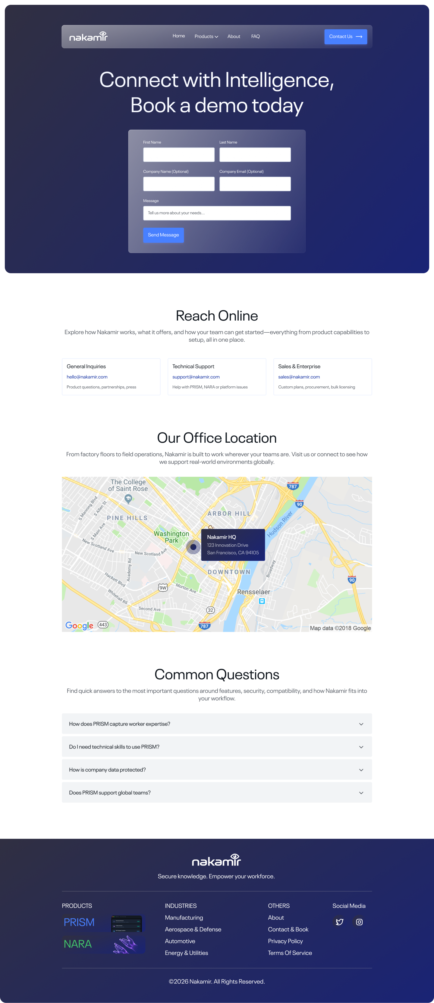
"Connect with Intelligence, Book a demo today" — demo form + direct contacts + office map. Both paths to conversion in one screen.
The brief evolved through one round of structured client feedback. Here's what shaped the final direction.
Mapped the old site section by section against the buyer journey. Identified every moment where the copy answered the wrong question — "what does this do?" instead of "what changes for my team?"
Defined the conversion architecture: hero → proof → product → industry fit → outcomes → objection handling → CTA. Applied this as the skeleton for every page, then filled in the content layer.
Client feedback confirmed the direction: "human worker-focused, not system-focused." Locked in the positioning anchor — "We make workers better" — and applied it to every headline and section heading.
Designed all 6 pages in Figma with connected prototype flows. Delivered with a Loom walkthrough for async stakeholder review — mobile design and development handoff queued as next steps.
Hero → 3 outcome proof points → product cards (PRISM + NARA) → before/after comparison → awards & accelerators (StartX, Founders Hub) → platform integrations → pricing comparison → FAQ.
Every section answers a buyer's next question. By the time they reach the footer, they've moved from "what is this?" to "where do I sign up?"
The NARA page leads with a video demonstrating real AR procedure guidance on a factory floor — not a marketing animation. Industry tabs below show specific use cases for Manufacturing, Aerospace, and Automotive with the regulations each one addresses.
The "Nakamir Difference" section runs Traditional Training vs. NARA side by side — with a 95% procedure accuracy stat that procurement committees can cite in approval requests.
PRISM's page opens with the clearest possible explanation of its value: screen record → structured step-by-step document, automatically. No manual documentation work. The hero video shows the exact workflow.
87% error reduction, 3 days average training time (down from 3 weeks), and 90% process standardisation across sites — specific enough to be convincing, broad enough to apply across verticals.
The About page closes the "who are these people?" loop — Stanford accelerator roots, a named founding team, and an Origins & Evolution timeline that shows a company building momentum, not scrambling to find PMF.
Contact gives buyers two paths: a clean demo booking form for those ready to commit, and physical office details and direct contacts for enterprises who want to meet first. Both paths lead to the same outcome.
"Book a Demo" is the singular conversion action — no competing links, no secondary paths that dilute the click.
Manufacturing, Aerospace, Automotive, Energy — each with tailored use cases, compliance contexts, and outcome metrics.
Stats, testimonials, awards, and before/after metrics appear before each major CTA — buyers reach "Book a Demo" already convinced.
Every page reinforces: AI makes workers better, faster, safer — it doesn't replace them. The message that converts industrial buyers.
The first hero direction was a full-bleed video background with the headline "AI-Powered Workforce Training for the Modern Enterprise." Standard enterprise software positioning — felt safe, looked credible.
Early internal review feedback: "This sounds like every AI company right now." The real problem wasn't the execution — it was the frame. The headline spoke to the category, not to the buyer's pain point. An operations director watching new-hire ramp time drag quarter after quarter doesn't search for "AI-powered training platforms." They search for ways to stop losing institutional knowledge every time a senior worker retires.
The video was cut entirely. Replaced with a static hero featuring a worker in context — on a factory floor, in PPE — and the headline "We make workers better." Four words. No jargon. Speaks directly to the outcome the buyer is accountable for delivering. The rest of the page was built to prove that claim.
A dedicated pricing page — the current site routes all pricing questions to "Book a Demo." For self-serve or SMB segments within their ICP, a clear tier comparison (with a free trial or pilot option) would capture buyers who aren't ready to talk to sales but are ready to start. Gating all conversion behind a human touchpoint loses the impatient 20%.
The hero message. "Turn Real Work Into Structured Training" tests against alternatives like "Your best worker's knowledge, in every new hire's hands from day one." The second frame is more emotionally loaded — it speaks to knowledge transfer anxiety rather than training speed. Both are valid; only testing tells you which converts better for this audience.
CRO for enterprise B2B isn't about micro-optimisations — it's about narrative architecture. The difference between a site that generates demo requests and one that doesn't is rarely the button colour. It's whether the buyer, by the time they reach the CTA, has had every major objection answered and seen enough proof to believe the switch is worth the risk. Design serves that story.