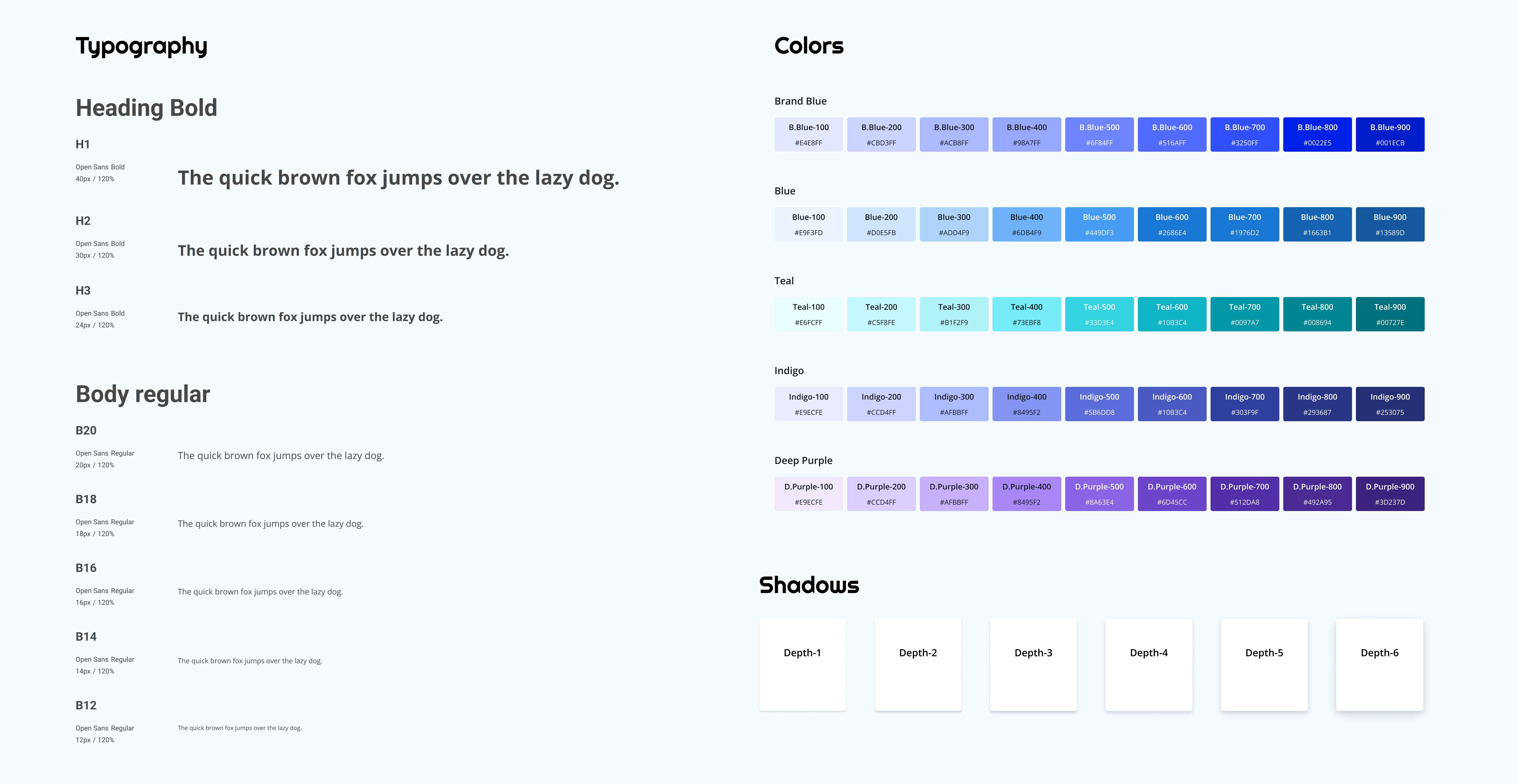
Solution — Foundations
Variables, variants and properties — the machinery behind every screen
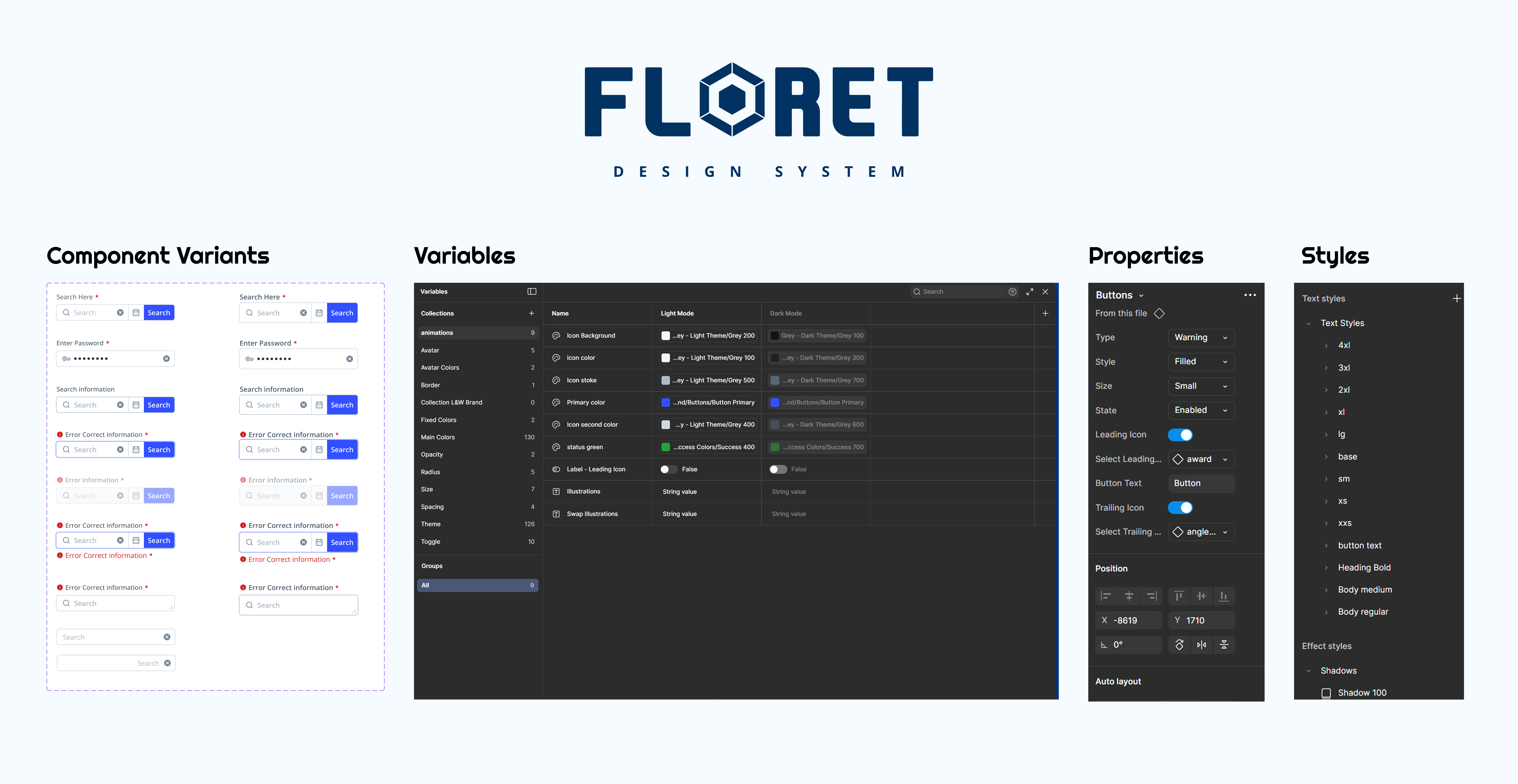
Component foundations
One component. Every state. No duplication.
Every component in Floret is assembled from three building blocks: a Variable that holds the value, a Variant that defines the state (rest, hover, focus, disabled, loading), and a Property that switches intent (primary, secondary, danger, ghost).
The Figma Variables panel (centre) shows Light/Dark modes mapped to semantic tokens. The Properties panel (right) shows how those tokens bind to a specific component. This is how a button stays consistent across 90+ screens — and stays correct after a rebrand.