Rebuilding BuyerAssist from the ground up — so buyers actually close
BuyerAssist is a B2B SaaS platform that helps enterprise sales teams guide buyers through complex purchasing decisions — reducing deal cycles and increasing close rates by giving buyers a structured, collaborative experience instead of a flood of emails and disconnected documents.
Version 1.0 had grown organically over two years, resulting in an inconsistent UI, fragmented component library, and a steep learning curve that was killing trial conversions. The goal of 2.0 was a full design system overhaul — not cosmetic updates, but rearchitecting the product from foundations up.
How might we compress the complexity of enterprise sales into a platform that a new user can learn in under 90 minutes — without sacrificing the depth that power users need?
Over 40+ button variants, 3 different modal styles, and zero shared spacing scale across the product. Every screen felt like it was designed by a different person.
New users required 3+ hours of training before becoming productive. Trial drop-off was 68% — meaning most potential customers were leaving before they ever saw the value.
Designs lived in scattered Sketch files with no tokens, annotations, or component documentation. Engineers re-implemented the same patterns from scratch every sprint.
Color contrast failed WCAG AA in 60% of screens. No keyboard navigation support existed. The product was unusable for a meaningful portion of enterprise users.
We conducted 12 user interviews across sales reps, managers, and buyers. Sessions were 45 minutes each, mixing contextual inquiry with task-based usability tests on the existing product. The goal was to understand real workflows, not just map UI frustrations.
Semantic color system with 5 scales (primary, neutral, success, warning, error), each with 10 stops. All pairs pass WCAG AA — no exceptions.
8-step type scale built on a 1.25 modular ratio. Separate display, body, and mono stacks with line-height and letter-spacing tokens for consistency at any size.
4px base grid with a T-shirt sizing alias system (xs→3xl). 12-column responsive grid with defined breakpoints at 375, 768, 1024, and 1440.
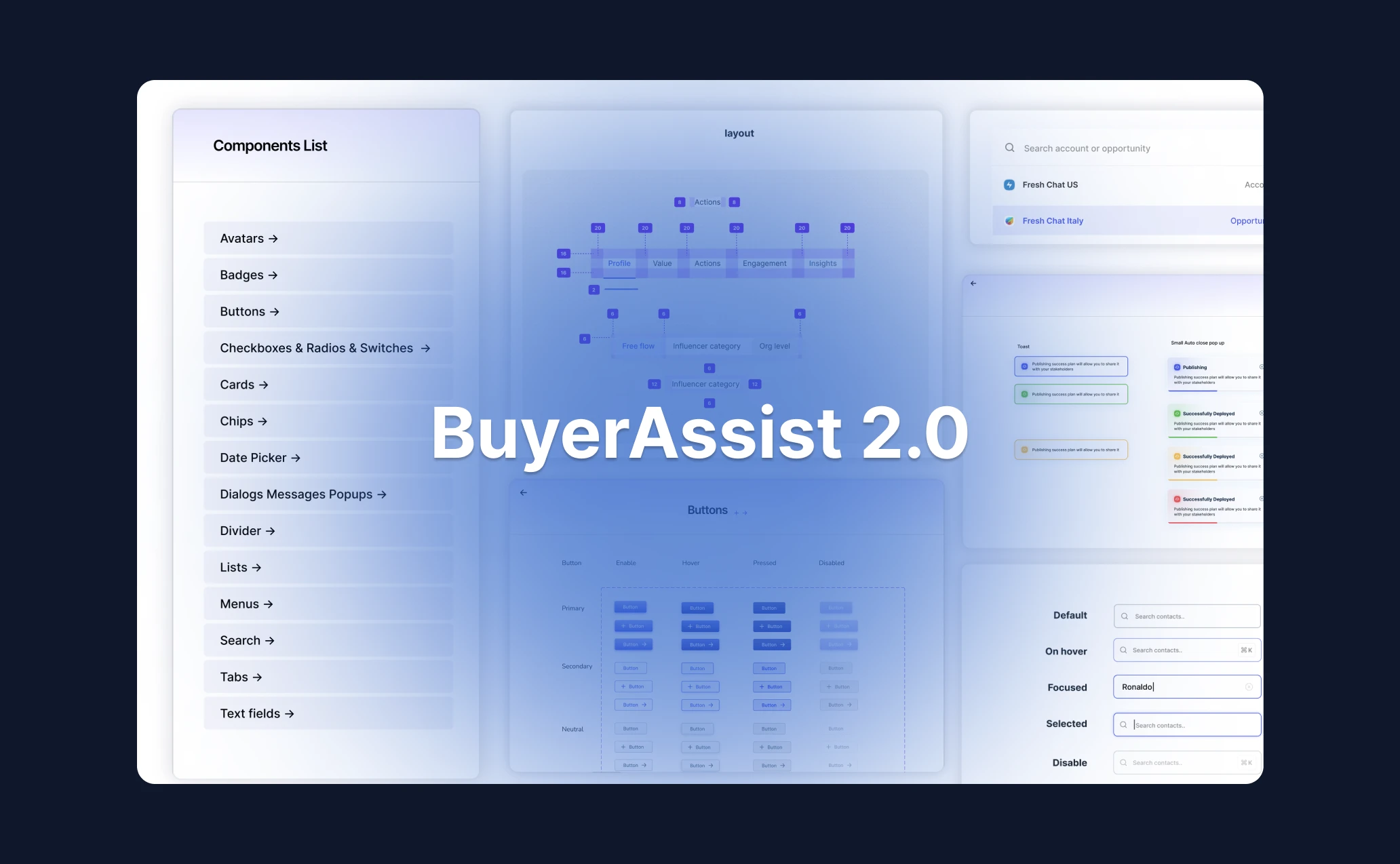
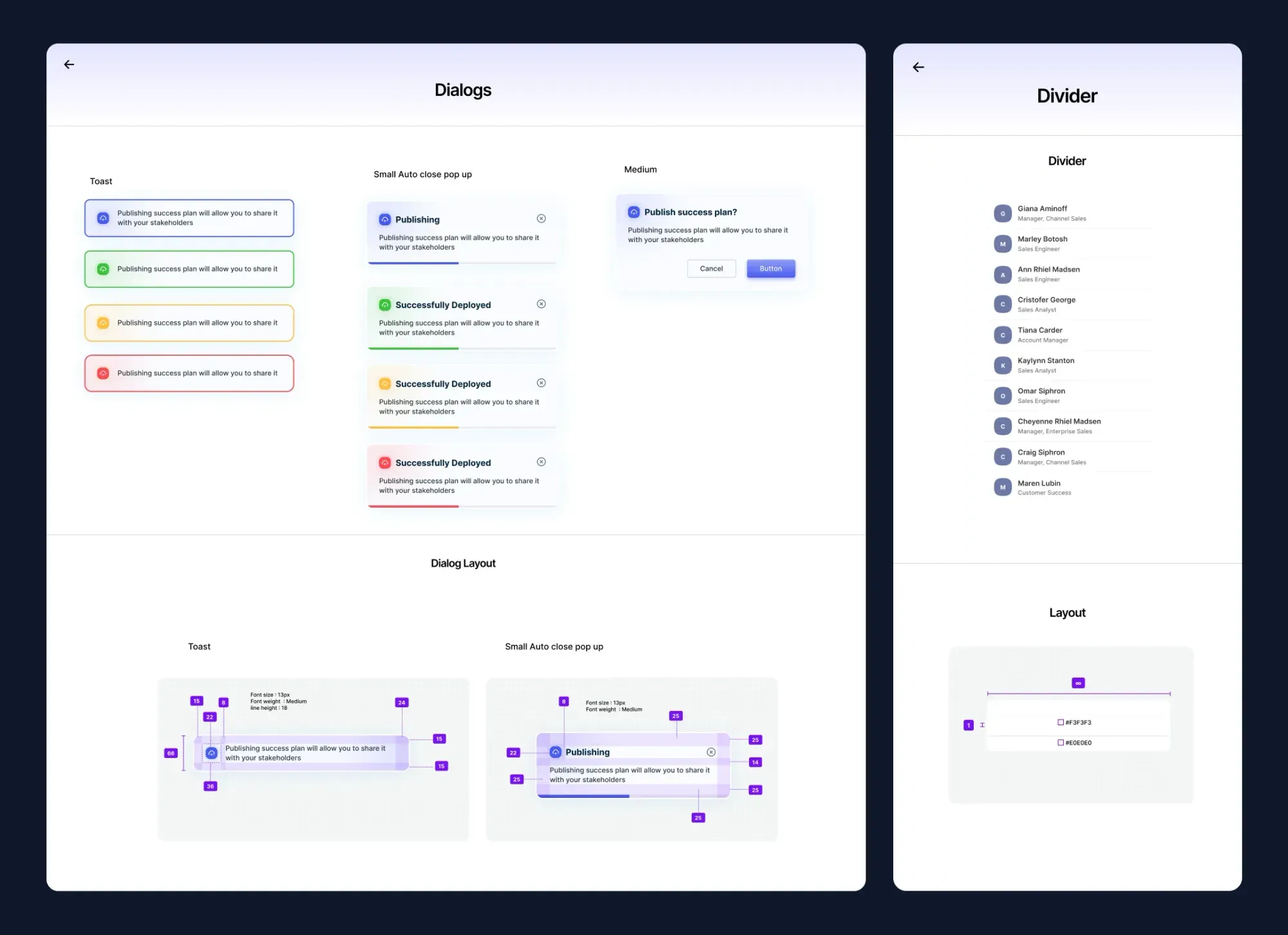
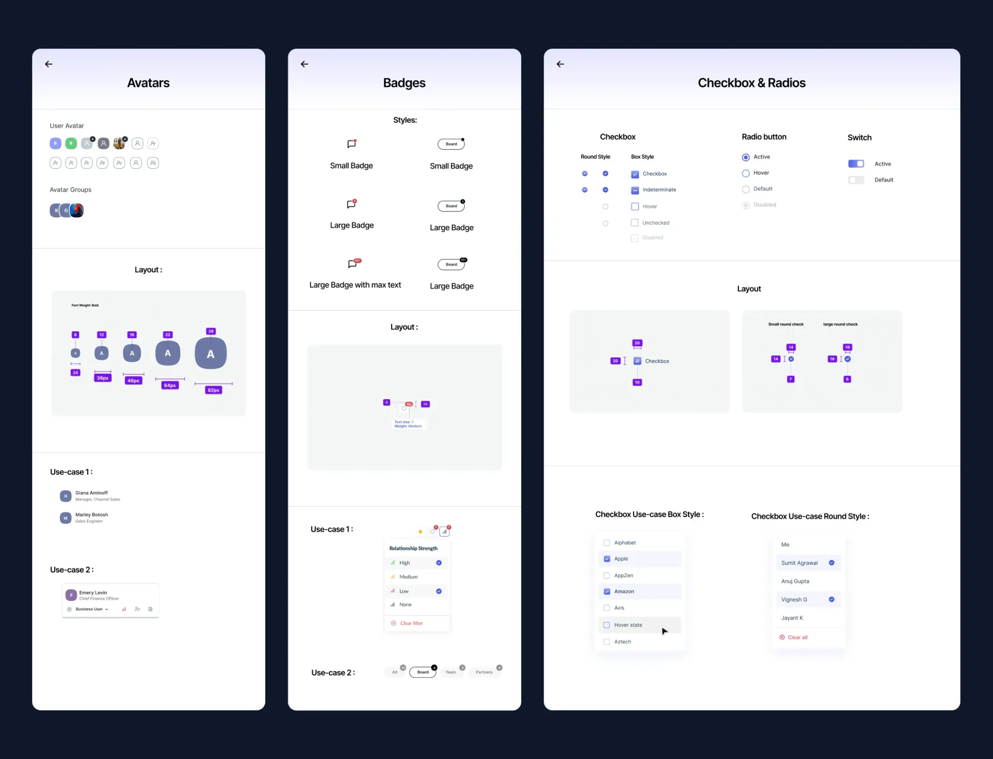
82 base components, each with 4–6 states and full variant coverage. Documented in Storybook with usage guidelines for every component.
Easing curves, duration tokens, and reduced-motion support baked into every animated component from day one — not added at the end.
Focus rings, ARIA roles, keyboard nav, and color-blind-safe palettes built in from the start — not bolted on as an afterthought during QA.
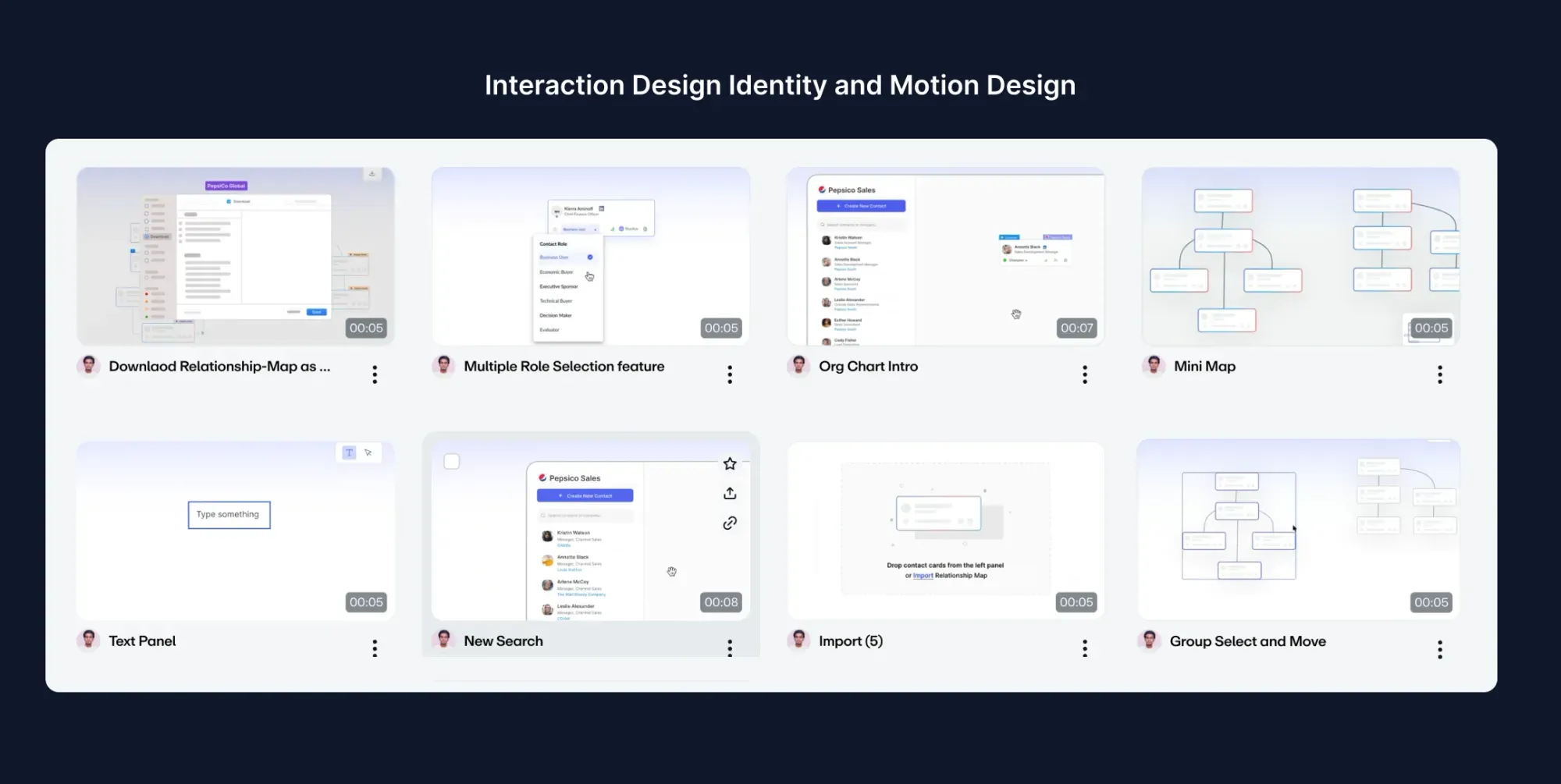
User flow mapping — deal lifecycle from creation to buyer sign-off
Mid-fidelity wireframes — information architecture validated before visual design
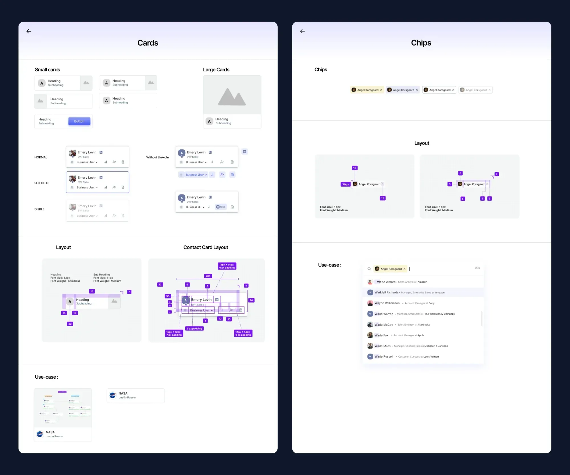
Component exploration — 312 unique UI elements consolidated into 82 reusable components
Final screens — the complete 2.0 redesign across desktop and responsive breakpoints
Catalogued every UI element across 120+ screens. Identified 312 unique components that could be consolidated into 82 — exposing the full scale of the inconsistency problem and giving us a concrete consolidation target.
Defined a three-tier token system: primitive → semantic → component. This enabled dark mode and white-label theming from day one — features that enterprise sales tools need but rarely plan for at the start.
Built components in Figma using Auto Layout, variants, and interactive states. Each component had a paired Storybook story — design and code in sync from the first build, not the last.
Redesigned all 120+ screens using the new system. Ran usability tests at mid-fidelity before moving to hi-fi — catching navigation and flow problems before they became expensive to fix.
Used Figma's inspect panel and custom annotations. Worked directly with engineers in two-week sprints throughout implementation — so questions got answered in Slack, not after a handoff document was already outdated.
New users became productive in under 90 minutes vs 3+ hours previously — the biggest single improvement in the product's history.
Drop-off during free trial fell from 68% to 37% within the first quarter post-launch.
Shared token system and component docs eliminated most back-and-forth between design and engineering.
All screens passed contrast, keyboard, and screen-reader audits on first QA pass — a first for the product.