Replacing scattered spreadsheets with a single loan-tracking pipeline
Conditionly is a web-based SaaS platform built for mortgage and loan processors. A loan "condition" is a document or piece of information a borrower must provide before a loan can be approved — things like bank statements, pay slips, signed disclosures, and appraisal reports. A single loan can have 15-25 conditions, and a processor typically handles 20-30 active clients at once.
Before Conditionly, processors managed all of this through a mix of emails, shared spreadsheets, and handwritten notes. There was no single source of truth. Conditions got missed, loan closings got pushed back, and the team had no way to see which clients were at risk at any given moment.
The core goal: Give loan processors complete visibility across every client and every condition — without adding complexity to an already demanding job.
Processors sent condition lists via email and tracked replies manually. With 20+ active clients, it was impossible to know what was outstanding without opening and re-reading every thread.
Teams used shared spreadsheets to log conditions — but they were updated manually, went stale fast, and gave no real-time view of progress. A "pending" item could have been resolved days ago.
Loan officers and processors worked in silos. There was no shared dashboard, so officers had to call or email to check status — creating interruptions that slowed everyone down.
A single overlooked condition could push a loan closing back by 1-2 weeks. In a volume-based business where dozens of loans close per month, delays had direct revenue impact.
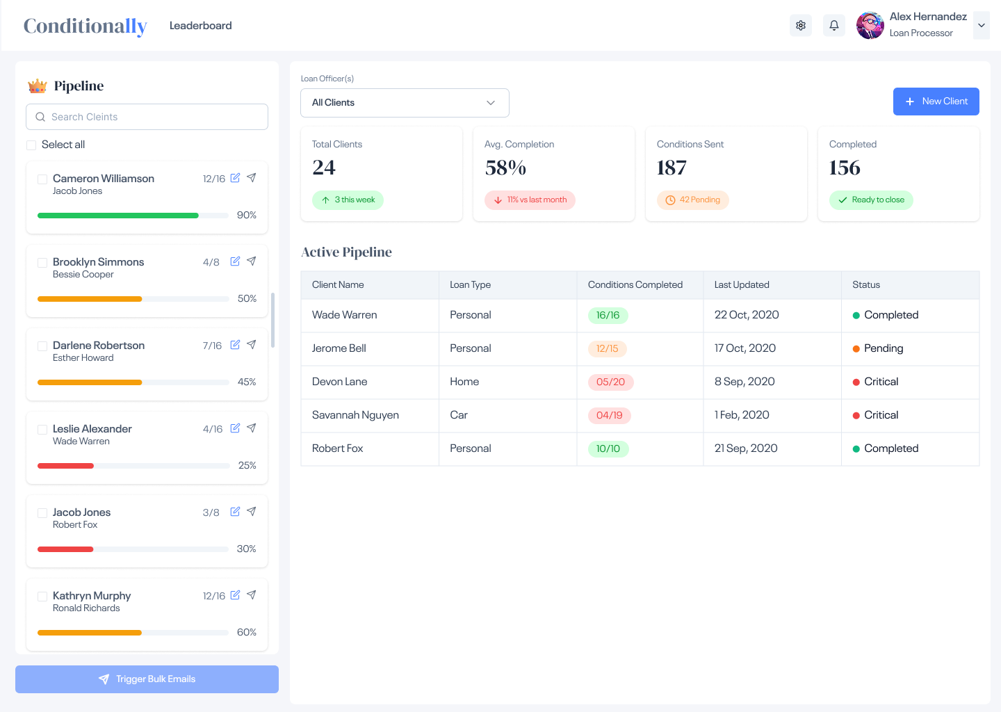
The central design idea was a persistent client pipeline — a live list of every active borrower, their condition progress, assigned officer, and current status. Instead of opening 30 email threads, a processor can see their entire book of business in one view.
Each client row in the pipeline expands to reveal a structured condition checklist — items marked pending, received, or approved. Color-coded status labels make outstanding items impossible to miss, even when managing 25+ clients simultaneously.
Sending condition reminders — previously a manual one-by-one process — became a bulk action: select multiple clients, send reminders in one click. What took 30 minutes now takes 30 seconds.
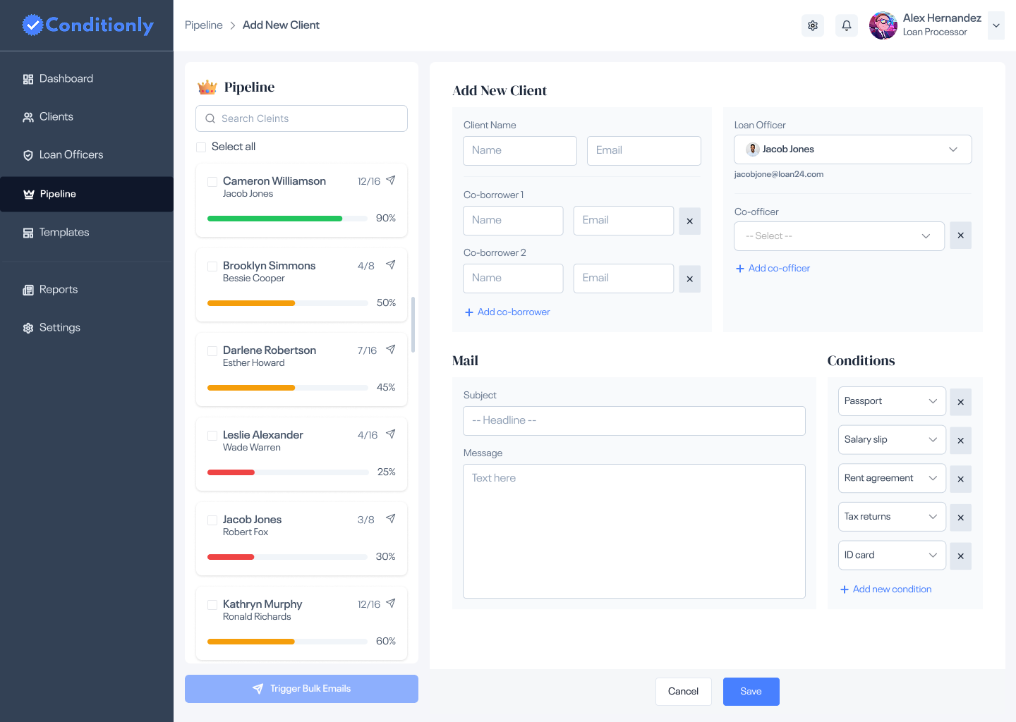
New clients are onboarded in a single form — name, officer assignment, loan type, and initial condition list. Condition templates speed this up for common loan types. What used to require creating a new spreadsheet tab now takes under two minutes.
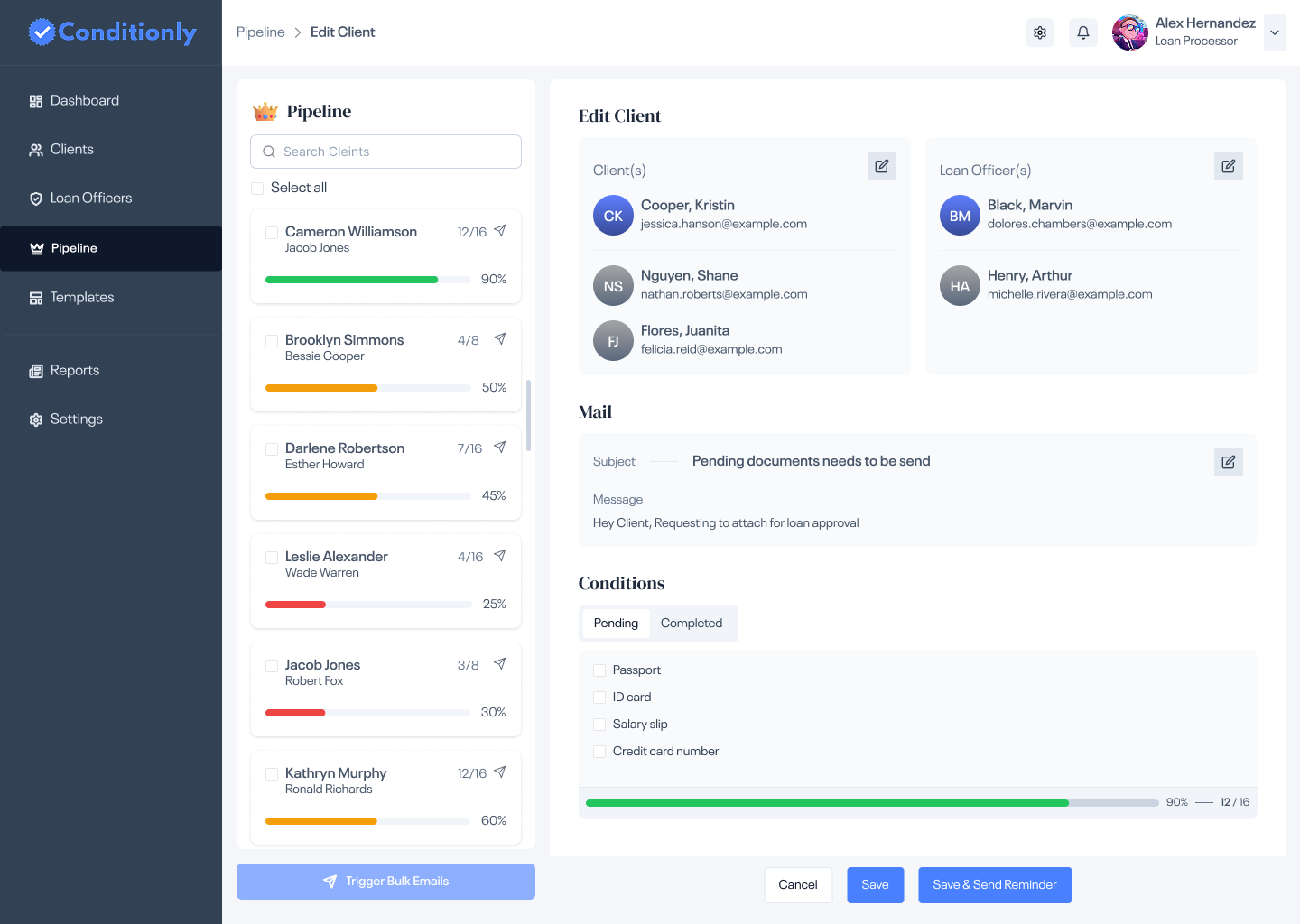
The condition detail view shows every item with its current status and timestamp. Processors can mark items received, flag blockers, and send targeted or bulk reminder emails directly from this screen — no switching to a separate email client.
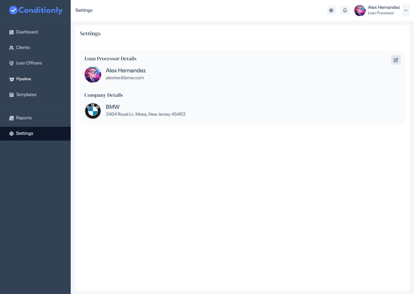
Admins manage loan officers, email templates, and company branding in a clean settings panel. Officer accounts can be added or deactivated without affecting their assigned client records.
Most SaaS tools lead with a summary dashboard full of charts. Processors don't need charts — they need to act. The pipeline puts every active client in one scannable list, so the first screen is also the working screen. No extra click required to get to work.
Early conversations with processors revealed that free-form notes created the same ambiguity as email. Conditions needed to be discrete, trackable items with defined states (Pending / Received / Approved). A checkbox with a label beats a paragraph of notes every time.
When a processor is scanning 25 client rows, they shouldn't need to read each one. Red means action needed. Yellow means in review. Green means clear. The color system lets the eye spot at-risk clients in under two seconds — a decision made for the real cognitive load of the job.
Sending condition reminders was the most repeated task in a processor's day — yet it was completely manual. Making bulk selection and reminder delivery a first-class feature (not buried in a menu) turned a 30-minute daily routine into a 30-second one.
Marking a condition complete or sending a reminder email are irreversible actions that affect real loan timelines. Clear confirmation states — a success toast after sending, a visual "completed" badge after marking — give processors the confidence that the action registered, reducing repeat-clicks and errors.
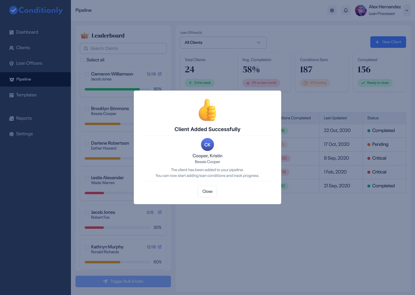
After adding a new client, a success state confirms the action immediately. In a high-volume environment where processors add multiple clients per day, clear feedback removes doubt and keeps the workflow moving.

When every condition for a client is marked complete, the UI shifts to a clear "all clear" state — a satisfying moment that signals the processor can move this loan to closing. In a job defined by checklists, this moment matters.
Every condition, every client, every officer — visible in one workspace. No more cross-referencing emails and spreadsheets.
Bulk condition reminders replaced daily one-by-one emails — from 30 minutes to under 60 seconds per day.
Structured checklists and color-coded status eliminated the "I forgot to follow up" problem entirely.
Loan officers can check any client's condition status without calling or emailing the processor — reducing daily interruptions.