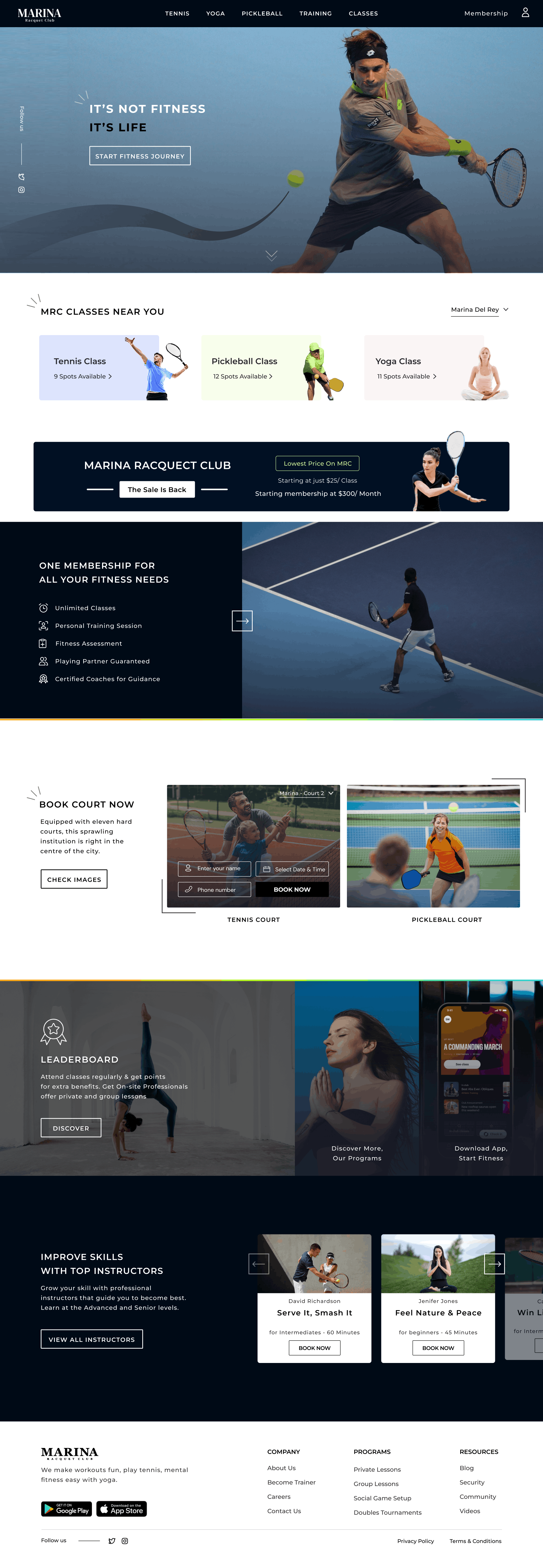
A desktop landing page for Marina Racquet Club (MRC) — a modern tennis and fitness facility. The design needed to drive three distinct actions: class bookings, court reservations, and membership sign-ups — all within a single scrollable page that also communicates premium quality.
The problem it solved: Sports club websites typically suffer from one of two problems: they look like corporate brochures (beautiful but passive) or like booking engines (functional but cold). MRC needed a page that converted visitors into members while feeling genuinely aspirational — not just promotional.
A bold black-and-white system with high-contrast photography. Each section is purpose-built around a specific conversion goal — class availability cards, a promotional membership banner, a split court reservation block, an instructor showcase, and a leaderboard teaser. Every scroll has a clear next action.
The class booking section shows live spots — '9 Spots Available', '12 Spots Available' — directly on the landing page. Scarcity signals create urgency without manufactured pressure. Users who see 9 remaining spots feel motivated to act.
The dark 'Marina Racquet Club — The Sale Is Back. Starting at just $25/Class' banner cuts across the page at full width — deliberately breaking the visual flow to maximise notice. A soft in-line promotion would be ignored. This isn't.
Rather than a simple form, the court booking section is shown as a mini UI — with court name dropdown, date/time selector, and a 'Book Now' button overlaid on actual court photography. The form feels like a preview of the experience, not admin.
Each instructor card shows name, specialty, level, and duration — then a 'Book Now' CTA underneath. Users never have to go to a separate page to book a session. Reducing steps to conversion directly increases bookings.
Class booking, court reservation, and membership — all actioned without leaving the landing page.
Available spots shown per class — motivating faster booking decisions.
Full-width promotional strip maximises visibility of the membership offer.
Name, specialty, and Book Now on each instructor card — zero extra clicks.