An alternative dark-mode redesign of the Fietstest platform — the same content as the light version but repositioned for a tech-savvy, performance-focused audience. Where the light design leads with trust, this version leads with capability and data.
The problem it solved: The light design appealed to mainstream buyers but felt too soft for performance cyclists who wanted technical depth — specs, comparisons, and filtering by battery or pedal assist. A single visual identity couldn't serve both audiences equally well.
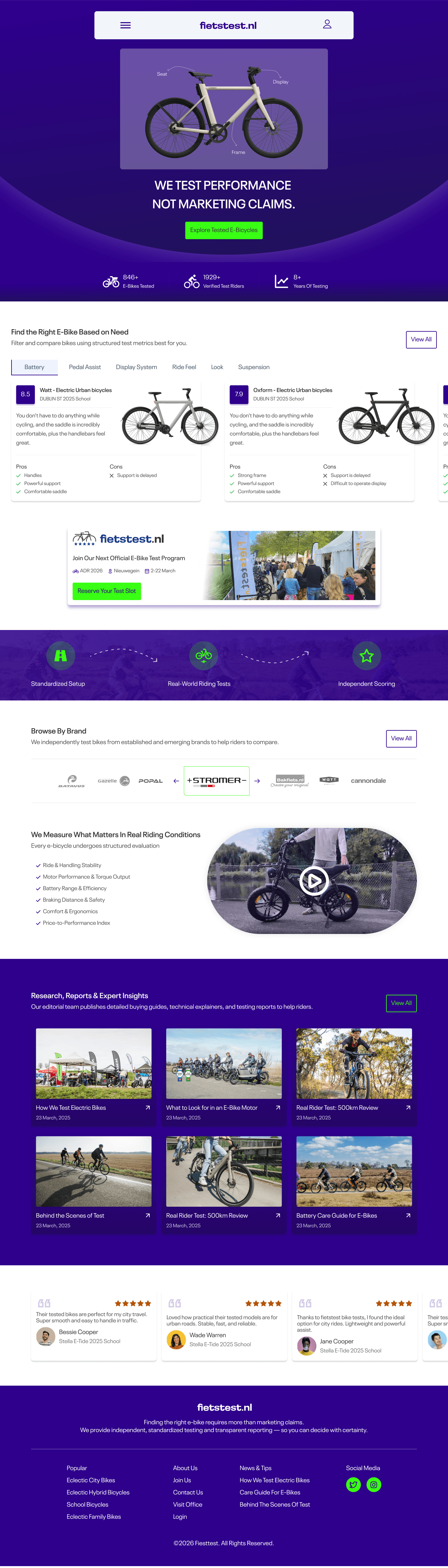
A deep-purple dark mode with a data-forward structure. The hero leads with 'We Test Performance, Not Marketing Claims' — a bolder, more confrontational positioning. Below it: structured comparison cards with pros and cons, a brand browse section, an editorial article grid, and a 3-step testing framework visualised as connected nodes.
The colour switch from white to deep purple isn't cosmetic — it signals a shift in audience. Performance cyclists associate dark interfaces with precision tools (Garmin, Wahoo, Strava). The palette earns credibility before a word is read.
Star ratings flatten nuance. Pros and cons cards — 'Powerful support / Support is delayed' — give riders the same information a trusted friend would give. More useful, more honest, more distinctive.
The filter tabs lead with Battery, Pedal Assist, Display System, Ride Feel — not by brand or price. This surfaces the platform's analytical depth and appeals to buyers who care more about how a bike performs than who made it.
Six article cards near the bottom — 'How We Test', 'What to Look for in an E-Bike Motor', '500km Review' — signal that fietstest has intellectual depth, not just scores. This builds long-term reader trust and SEO equity simultaneously.
Purple palette signals precision tools — immediately differentiating from mainstream review sites.
Replaces blunt star ratings with nuanced, real-world insight per bike.
Riders filter by battery, display, ride feel — not just brand or price.
6 editorial cards signal expertise and long-form testing beyond surface scores.